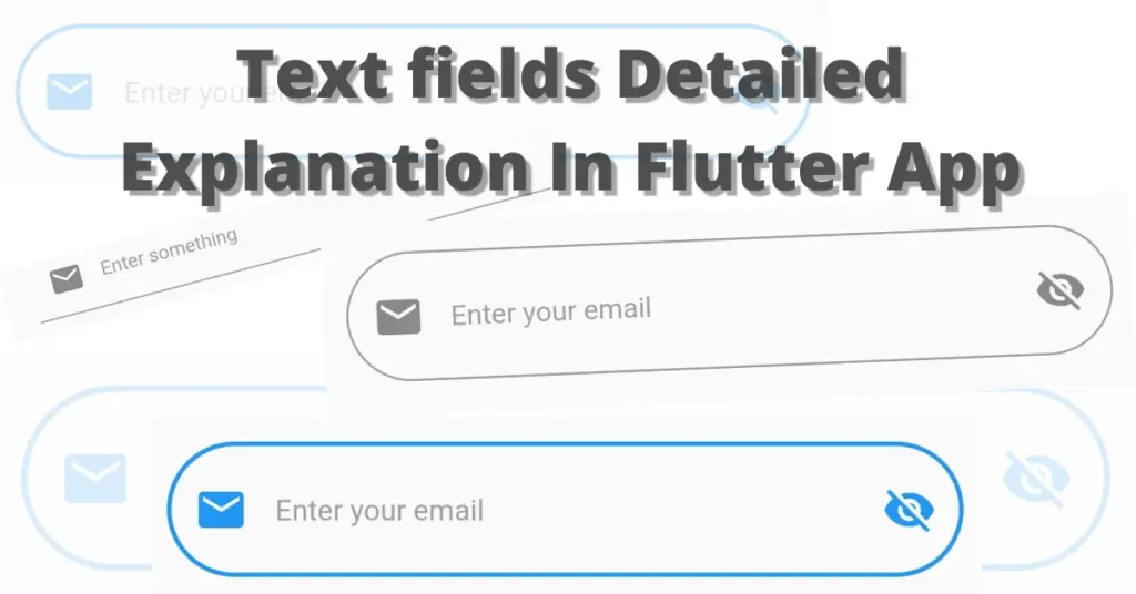
In this tutorial, we will explore the Flutter textfield widget. We’ll delve into what it is, its purpose, and how it can be used in a Flutter app. We’ll go through multiple code examples to better understand this widget.
What is Flutter Textfield Widget?
The text field is used to input values from users in the flutter app. The input is in the form of a string. Some examples include the login screen where the user is required to input an email or password or the registration screen where a new user is added based on the data that is inputted using the text fields.
Let’s now directly jump into the textfield implementation.
Flutter Text Field Implementation
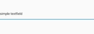
Scaffold(
        body: Center(
          child: TextField(),
        ),
      )

Input Text Style
style: TextStyle(
        color: Colors.blue.shade900,
        fontSize: 20
                )
Remember, it will only style the text that will be inputted by the user. You can see in the image that the inputted text is blue.
Input Decoration
 TextField(
        decoration: InputDecoration(),
          )
Flutter Textfield Hint Text
decoration: InputDecoration(
              hintText: 'Enter something'
                           )

Using the hint text constructor of the input decoration class, we can give a hint message to the user about what to fill in that specific field or any text we want, whenever the user starts inputting value in that textfield then that hint text disappears, and if the user removes all the inputted value then this hint text will again be visible.
Flutter Textfield Hint Style
hintStyle: TextStyle(color: Colors.grey, fontSize: 15)

We can use the hint style constructor of the input decoration class to style our hint text. As you can see above, we have specified the hint text color to grey and the font size to 15. You can change other properties like font weight, style, etc.
Flutter Textfield Fill Color and Filled
fillColor: Colors.blue.shade200,
filled: true,

For that, you must use the filled constructor as well, which takes a Boolean(true, false) value. So, to see the fill color that you specify, you must set the filled constructor to true. Now, if you look at the image, you will see a flutter textfield filled with a blue color. We have made the hint text color white just for demonstration purposes.
Note

Flutter Textfield Prefix Icon
prefixIcon: Icon(Icons.email)

Flutter Textfield Prefix Icon Constraints
prefixIconConstraints:
     BoxConstraints(maxHeight: 30, maxWidth: 30)

Flutter Textfield Suffix Icon and Constraints
  suffixIcon: Icon(Icons.visibility_off),
  suffixIconConstraints:
        BoxConstraints(maxHeight: 30, maxWidth: 30)

Flutter Textfield Prefix
prefix: Icon(
             Icons.email,
             color: Colors.grey,
              size: 14,
                  )

It is different from the prefix icon, the constructor prefix takes a widget and is only visible when the user taps on the text field or starts typing. When the text field is focused, we can see the prefix. As you can see in the image above, the small email icon after the prefix icon is the prefix.
Flutter Textfield Border
 border: OutlineInputBorder(
                      borderRadius: BorderRadius.circular(50),
                      borderSide: BorderSide(color: Colors.grey)
                           )
We have used the border-radius constructor to make the edges rounded and the border side constructor of the outline input border to make the border color grey, we can use the width constructor of the border side class to make the border thick or thin by passing greater or less value to it.
Flutter Textfield Auto Focus
autofocus: true

Conclusion
As a final point, we hope that you have gained a comprehensive and practical understanding of how to effectively customize the Flutter textField widget. We look forward to receiving your valuable feedback.
We’d be super delighted to see you visit our other articles on Flutter app development and Python programming. Thank you for reading this one.
