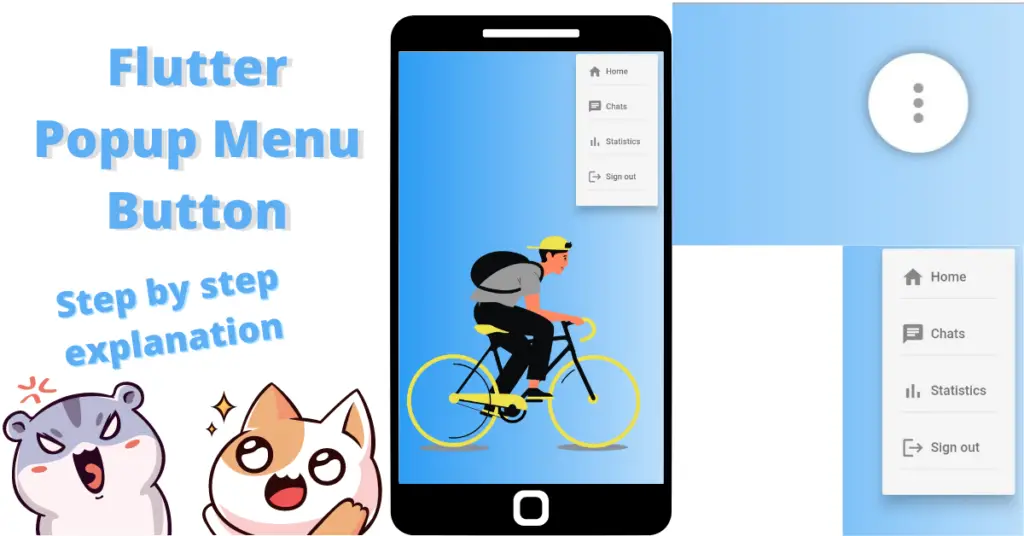
Let’s talk about developing the mentioned Flutter popup menu example in the flutter app, how we can see a Flutter popup dialog using the Flutter popup menu button, but first, if you are new and want a complete setup and want to build your first app instantly, then click here, now let’s jump into understanding step by step of achieving the mentioned beautiful popup menu button in flutter app with Flutter popup menu example.
Introduction: Flutter Popup Menu Button
It is one of the most beautiful menu that you can see in flutter app. You can see that menu in other applications as well. It is basically a menu that popup whenever you click on the button that is specified for it. It is like a drop down in which you can see a list of options and you can also give each of them some functionality. In our Flutter popup menu example, we will define the popup menu in the actions constructor of an appbar and will see how the menu pops up when we click on the popup menu button. So let’s get right into it.
Popup Menu Button
PopupMenuButton(
              onSelected: (value) {},
              itemBuilder: (context) {
                return [
                  PopupMenuItem(
                    value: 'Home',
                    child: Text(
                      'Home',
                      style: TextStyle(
                          color: Colors.black54,
                          fontSize: 13,
                          fontWeight: FontWeight.w500),
                    ),
                  ),
                ];
              },
            )
We have used the popup menu button class in our Flutter popup menu example, let’s see what we have used in it:
On Selected
The constructor on selected is triggered when the user taps on one of them items of the popup menu list. It takes a value constructor which has the value selected.
Item Builder
The item builder constructor is used to return a list of popup menu items.
Popup Menu Item
It is the individual item that will be shown in the popup menu item. We use popup menu item class for it. It has a value constructor which takes a string and that value will be returned to the on selected constructor. We can use that value specified to that item. Just keep in mind that make the value different for every item so you can use conditions using these values like if the value is ‘home’ then navigator to the home page etc. In the child constructor, we can use some widget like in our example, we have used a simple text for now. Let’s see how our menu will look now:

We have used a lottie animation and a background gradient to make this screen looks little good. As you can see, we now have an icon in the actions section of our appbar.Let’s see what happens when we click on it:
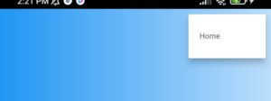
We can see that when we tap on that icon, a menu just popped up. This is our popup menu. For now, we are only seeing a home text in our menu and its not just a simple text, means its clickable. Let’s now give it some decoration.
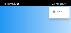
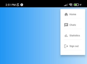
Popup Menu Item Customization
PopupMenuItem(
                    value: 'Home',
                    child: Column(
                        crossAxisAlignment: CrossAxisAlignment.start,
                        children: [
                          Row(
                            children: [
                              Icon(
                                Icons.home,
                                size: 20,
                                color: Colors.black45,
                              ),
                              SizedBox(
                                width: 5,
                              ),
                              Text(
                                'Home',
                                style: TextStyle(
                                    color: Colors.black54,
                                    fontSize: 13,
                                   fontWeight: FontWeight.w500),
                              ),
                            ],
                          ),
                          Divider()
                        ],
                      ))
Padding
padding: EdgeInsets.all(10)
Color
color: Colors.grey
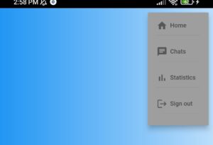
Flutter Popup Menu Icon Customization
child: Container(
                alignment: Alignment.center,
                height: 45,
                width: 45,
                margin: EdgeInsets.all(20),
                decoration: BoxDecoration(boxShadow: [
                  BoxShadow(blurRadius: 4, color: Colors.black45)
                ], color: Colors.white, shape: BoxShape.circle),
                child: Icon(
                  Icons.more_vert,
                  color: Colors.grey,
                ),
              )

Elevation
elevation: 10
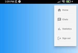
On Pressed Function
Let’s now understand how to use the value constructor, we will use a snack bar and give the value specified in value constructor of each menu item and we will see whether we get the value of the item pressed in our snack bar or not.
 onSelected: (value) {
                ScaffoldMessenger.of(context).showSnackBar(
                SnackBar(content: Text('$value item pressed')));
                     }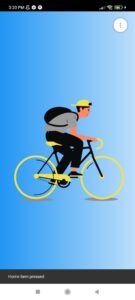
As you can see, we have pressed the home item and in the snack bar home string is show, it will show only the value that is passed to the value constructor. It can be something else like item one etc.
Conclusion
That’s all for this article, hope you enjoyed it and now have a complete understanding of Flutter popup menu example. Implement it in your code and share your experience with us. We would love to see how you have used it in your flutter app. We would be looking forward for your response. Hope to see you in our next articles in which we will dig deep into other amazing widgets. Thanks for reading.
