In this tutorial, we’ll walk ourselves through the Flutter column widget. We’ll learn how to properly make use of columns in Flutter in order to create different types of layouts or the ones that are specified in the requirements of your project.
The different properties and features that this widget offers will be explained with proper practical examples in this tutorial. So let’s jump right into its explanation phase.
What is Flutter Column Widget?
It’s a Flutter widget that takes a list of widgets as its children and stacks them in a vertical direction. It means the first child will be on top, the second one below the top, and so on.
We can also set the alignment of these children’s widgets. We’ll understand it in detail in the later sections.
Let’s now understand this column widget using practical code examples.
How to Use the Column Widget?
Column()
This is how we can create a column widget. In order to see it visually, we’ve to pass some children’s Flutter widgets to it.
Children of Column
Column(
     children: []
     )
The children constructor of the column takes a list of widgets. For simplicity, we’ll just pass a text widget to it. We can also pass other widgets as well like containers, rows, and so on.
The column widget allows us to pass different widgets. We can pass a text widget as the first child of the column and for the second one, we can pass an image widget, a container, a new column, a row widget, or any other widget of our choice. The order in which these widgets are placed can also change.
Let’s pass some text widgets to our column. See the below code:
Column(
      children: [
                Text('first child'),
                Text('second child')
                ],
    )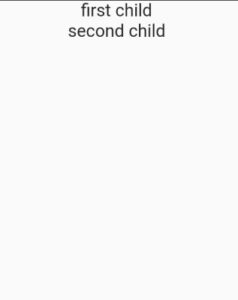
So this is how we can give multiple children to the column. Let’s now talk about the alignment property of the Flutter column.
Alignments in Column
There are two alignments in the column.
- Main Axis Alignment
- Cross Axis Alignment
Main Axis Alignment in Column
Column(
      mainAxisAlignment: MainAxisAlignment.start,
      children:[ //specify your widgets here ]
)
It specifies the alignment of the children’s widgets vertically(from top to bottom). Its properties are listed below:
- MainAxisAlignment.start
- MainAxisAlignment.center
- MainAxisAlignment.end
- MainAxisAlignment.spaceAround
- MainAxisAlignment.spaceBetween
- MainAxisAlignment.spaceEvenly
1. MainAxisAlignment.start

By default, this alignment is specified which sets the position of children widgets to the top.
2. MainAxisAlignment.center

It sets the children to center align.
3. MainAxisAlignment.end
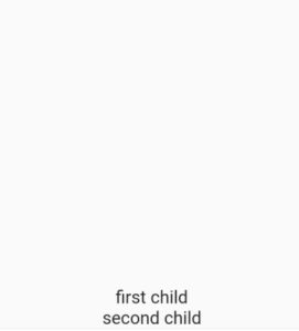
The children are aligned to the bottom using the end property of the main axis alignment.
4. MainAxisAlignment.spaceAround
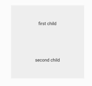
5. MainAxisAlignment.spaceBetween
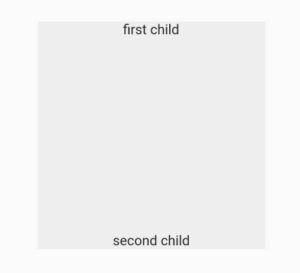
It only adds the space between the children’s widgets and not between the widget and the border.
6. MainAxisAlignment.spaceEvenly
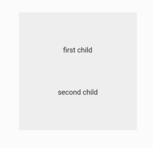
By using this property, we can give the same space/distance between the widgets and the borders.
Cross Axis Alignment in Column
Column(
      crossAxisAlignment: CrossAxisAlignment.center,
      children:[ //specify your widgets here ]
 )
In the case of columns in Flutter, the cross-axis alignment specifies the horizontal alignment (from left to right). Its properties are listed below:
- CrossAxisAlignment.center
- CrossAxisAlignment.start
- CrossAxisAlignment.end
- CrossAxisAlignment.baseline
- CrossAxisAlignment.stretch
1. CrossAxisAlignment.center
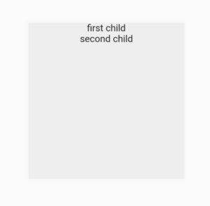
By default, the cross-axis alignment of the column is set to center.
2. CrossAxisAlignment.start
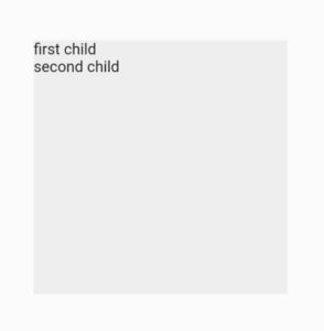
The start property set the alignment to the left which in terms of the cross-axis in the column is the start.
3. CrossAxisAlignment.end
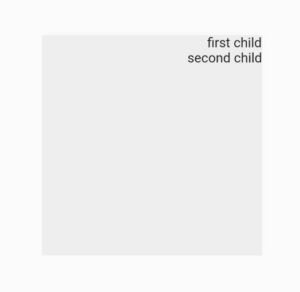
The end aligns the alignment to the right side. In the case of cross-axis alignment, it’s the end part.
4. CrossAxisAlignment.baseline
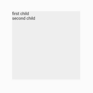
textBaseline: TextBaseline.alphabetic
In order to use the baseline, we’ve to specify the text baseline as well. For that, we’ve to use the text baseline constructor of the Flutter column widget. We can pass two properties to it. These are:
- TextBaseline.alphabetic
- TextBaseline.ideographic
5. CrossAxisAlignment.stretch
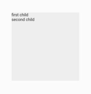
We want you to research the baseline and stretch properties and share the information with us. We’d love to add it in this post.
Main Axis Size
Column (
      mainAxisSize: MainAxisSize.min,
      children:[]
       )
A column widget has a constructor named main axis size. Using this constructor, we can specify whether we want the column to take the whole vertical space or cover only the space that its child widget covers. For that, we can use the below two properties:
- MainAxisSize.max
- MainAxisSize.min
1. MainAxisSize.max
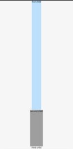
This is the default property of the main axis size. It specifies that the column will take all the vertical space. For demonstration, we’ve wrapped the column with a container and have given that container a background color to see the changes visually. We then passed this container to the body of the scaffold widget. See below.
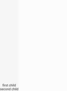
It shows the text to the end as we’ve set the main axis alignment to the end. We can see that the whole vertical space has been covered.
2. MainAxisSize.min

It allows the container to take only the size that its children cover as shown in the above image. We can see that the texts are shown at the top even if the main axis alignment is set to end.
We can also use widgets like expanded and flexible inside columns. Your task is to try them and share your feedback with us. We’d be super glad to add the best ones to this post.
Conclusion
So this is how we can properly make use of the Flutter column widget. Feel free to comment down if you still have questions regarding this Flutter widget. We’ll be happy to answer.
We’d also be happy to see you visit our other articles on Flutter app development and Python programming. Thank you for reading this one.
