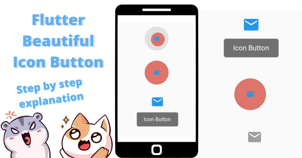
In this article, we will discuss flutter icon button in detail, how we can change the icon button size, how can we implement flutter icon button with text below, icon button with text implementation, how to achieve flutter icon button no splash, the usage and implementation of icon button onpressed function by using an icon button example, but first if you are new and want a complete setup and want to build your first app instantly, then click here, now let’s jump into flutter icon button.
Introduction: Flutter Icon Button
Basically flutter icon button, as the name suggests, is a button having icon and of course, more properties which we will look into in a bit. Let’s see how to implement it.
Implementation
IconButton(onPressed: () {}, icon: Icon(Icons.email))We have used a flutter icon button class, and inside it, we have used two constructors:
- Flutter icon button onpressed constructor is called whenever the uses clicks on the icon button, it is used to perform some actions when the user presses it.
- Flutter icon constructor is used to show an icon in the button, in our case, we have used an email icon.
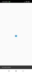
Let’s now see how the icon button will look after we run our app now:

As you can see, we now see an icon button with a simple icon, and is also clickable but we haven’t specify any functions yet. Let’s now customize it.

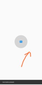
When we click on the flutter icon button then this grey colored circular background appears.
Flutter Icon Button Color
color: Colors.blue
By using the color constructor of flutter icon button class, we can change the color of icon if the color is not specified in the icon class of the icon constructor. Let’s see our flutter icon button color now:
Flutter Icon Button Size
iconSize: 30
Now after we specify some size of the flutter icon using the icon size constructor of flutter icon button class, let’s see how the flutter icon button size will look now, icon size constructor is used to increase or decrease the size of icon.

Flutter Icon Button Splash Radius
splashRadius: 100
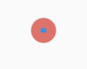
The flutter icon button splash radius constructor is used to increase or decrease the splash radius of the icon button, splash radius is the circular grey colored background that we see when we click or long press on the icon button. We have specified it to 100, now let’s see how the flutter icon button splash radius will look now after we click the button:
As we can see, the splash radius have extended, if you don’t want the splash radius, then just make it 1, although it will still be working but the spread will be so minimum that you won’t see it. Making the flutter icon button splash radius zero will result in an error. So in that way flutter icon button no splash or flutter icon button remove splash works.
Flutter Icon Button Disabled
disabledColor: Colors.grey

onPressed:null
To make the flutter icon button disabled, you have to pass null to the onpressed constructor which makes it disabled and alo non clickable and if you want to specify the flutter icon disabled color then use the disabled color constructor and give it the color you want.
Flutter Icon Button OnPressed
 onPressed: () {

            ScaffoldMessenger.of(context)

                .showSnackBar(SnackBar(content: Text('Icon button pressed')));

          }
By using the flutter icon button onpressed constructor, we have specified to show a snack bar with the content mentioned above in the code whenever the flutter icon button is pressed. Let’s see how it looks when we pressed the icon button:
Flutter Icon Button Padding
padding: EdgeInsets.all(100)
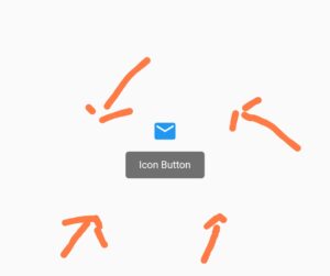
By using the padding constructor, we can actually increase the tap gesture area of our icon button. For demonstration, we have given it a padding of 100 from all sides. As you can see in the image below, we have tapped on that part of screen and still the flutter icon button onpressed function is called, which actually happens because of the padding that we used. It has increased the size of the icon button.
Flutter Icon Button Splash Color
splashColor: Colors.red
By specifying the splash color constructor, we can see a splash animation when we tap on the button or long press on it.
Flutter Icon Button Tooltip
tooltip: 'Icon Button'
The flutter icon button tooltip constructor takes a string, which shows if the user long presses on the icon buttons as shown in the above image.
Flutter Icon Button Constraints
constraints: BoxConstraints(minHeight: 500, minWidth: 500)
Using the constraints constructor, we can specify the flutter icon button min height, flutter icon button min width, flutter icon button max height, flutter icon button max width. We have given min height and min width of 500, the icon button now have a bigger size and if we tap on that range of area then it will trigger the onpressed function, as you can see in the below image:
Conclusion
That’s all for this article, hope you enjoyed it and have learnt a lot from it. Implement it in your code and share your experience with us. We would love to see how you have used it in your flutter app. We would be looking forward for your response. Hope to see you in our next articles in which we will dig deep into other amazing widgets. Thanks for reading.

