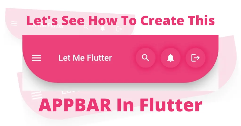
Let’s talk about how you can develop the mentioned beautiful app bar in Flutter. We’ll discuss its implementation in detail with the help of practical code examples. So let’s get right into it.
Flutter Appbar Widget
App bar in Scaffold
Scaffold(
 appBar: AppBar()
       )
We must use a scaffold, and by using its app bar constructor, we will use our app bar. For that, use the App bar class, which you can see above. Let’s see how our app bar will look after we implement this code:

Background Color of Appbar
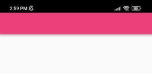
Now let’s change the background color of our app bar. Let’s see how we can do it:
AppBar(
  backgroundColor: Colors.pink.shade400
      )
We use the background color constructor to change the color of the app bar. Let’s see how it looks now:
Height Of Appbar
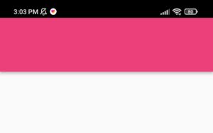
Now let’s change the height of our app bar. As you can see in the mentioned design, its a bit heightened, so let’s understand, how we can do that:
AppBar(
)
We have used the toolbar height constructor for this, it takes a double but you can also pass an int. It will parse the int to double itself. Let’s see how our app bar is looking right now:
Drawer Icon In Appbar
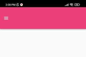
Let’s see how to implement the drawer icon in the app bar.
Scaffold(
            drawer: Drawer()
             )
Title In Appbar
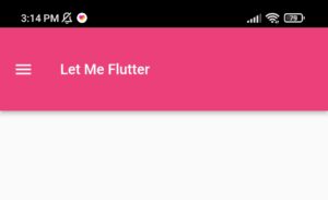
Let’s see the implementation of the title text in the app bar.
AppBar(
)
Rounded Cornered Appbar
AppBar(

       shape: RoundedRectangleBorder(

                      borderRadius:  BorderRadius.only(

                                                bottomRight: Radius.circular(70),

                                                bottomLeft: Radius.circular(70))

                                                     )

           )
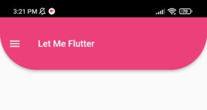
As we can see in this code, we have used the shape constructor of the app bar, and passed it a round rectangle border class, using the constructors of the round rectangle border class, we have specified which corners we want to modify. Let’s see our app bar now.
Appbar Elevation
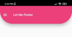
It is used to give some elevation effect to our app bar. We can see there is some shadow that our app bar possesses. Let’s seee how we can increase it to match our mentioned app bar’s shadow.
AppBar(
 elevation: 14
)
We use the elevation constructor for this, you can play with it by giving it more or less value. Our app bar looks like this now.
Actions In Appbar
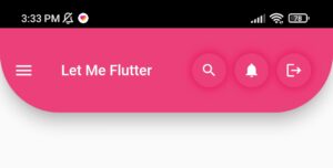
The app bar actions constructor is used to show multiple icons, texts, or other widgets on the right end side of the app bar. In our case, we have used three icons. Let’s see how we can implement it.
 actions: [

              Row(

                children: [

                     Container(

                    height: 40,width: 40,

                  alignment: Alignment.center,

                    decoration: BoxDecoration(

                      boxShadow: [

                        BoxShadow(blurRadius: 7,spreadRadius: 3,

                          color: Colors.pink

                        )

                      ],

                      shape: BoxShape.circle,

                      color: Colors.pink.shade400

                    ),

                      child: Icon(Icons.search,size: 20,

                      ),

                  ),

                  SizedBox(width: 10,),

                  Container(

                    height: 40,width: 40,

                  alignment: Alignment.center,

                    decoration: BoxDecoration(

                      boxShadow: [

                        BoxShadow(blurRadius: 7,spreadRadius: 3,

                          color: Colors.pink

                        )

                      ],

                      shape: BoxShape.circle,

                      color: Colors.pink.shade400

                    ),

                      child: Icon(Icons.notifications,size: 20,

                      ),

                  ),

                  SizedBox(width: 10,),  Container(

                    height: 40,width: 40,

                  alignment: Alignment.center,

                    decoration: BoxDecoration(

                      boxShadow: [

                        BoxShadow(blurRadius: 7,spreadRadius: 3,

                          color: Colors.pink

                        )

                      ],

                      shape: BoxShape.circle,

                      color: Colors.pink.shade400

                    ),

                      child: Icon(Icons.logout,size: 20,

                      ),

                  ),

                  SizedBox(width: 26,)

                ],

              )

            ],
The actions constructor takes a list of widgets, so we have passed three containers to it, if you want to learn how to customize a container then click here. Congrats, you have made the app bar that was mentioned. Let’s see it now.
Conclusion
In conclusion, we hope by reading this article, you’ll have a complete understanding of how to implement this beautiful Flutter appbar widget. We’ll be looking forward to have your response to this post.
We’d also be glad to see you visit our other tutorials on Flutter app development and Python programming. Thank you for reading this one.
Superb
Thanks and keep supporting.
Thank You
Thanks for the support. Do visit my other articles. Thanks