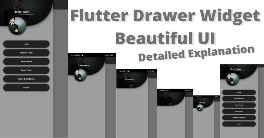
In this article, we will learn what Flutter drawer widget is, its role and how is it created. So without wasting any more time, let’s just get right into implementing our beautiful Flutter drawer widget UI.
Outline
- Introduction: Flutter Drawer Widget
- Flutter Drawer Implementation
- Customizing Flutter Drawer Widget
- Background Color
- Elevation
- Shape
- Child
- Implementing The Drawer Design
- Conclusion
Introduction: Flutter Drawer Widget
Drawer widget is a very beautiful approach for navigation to different screens within the Flutter app. So, let’s get right into implementing it.
Flutter Drawer Implementation
drawer: Drawer( )
Drawer constructor of Flutter scaffold widget is used for implementing the drawer widget. We have to pass the drawer widget, as shown in the above code. Although the drawer is implemented but we won’t see it on the screen. Reason is that the drawer needs
appbar widget as its
icon will be shown inside it. For that, we have to use appbar widget. See below code:
appBar: AppBar(backgroundColor: Colors.black54)
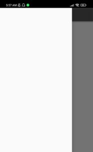
We can see in the above image that by implementing an appbar widget, we’re now able to see a leading icon in our appbar. This is an icon that will show Flutter drawer, if clicked. After we click on it, we will see a drawer slides from left. This is the default Flutter drawer widget. See the below image:
Customizing Flutter Drawer Widget
Let’s now understand how to properly customize our drawer widget.
Background Color
backgroundColor: Colors.grey
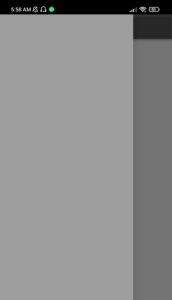
Using the background color constructor of Flutter drawer class, we can change the background color of drawer, which by default is set to white. For demonstration, we have set it to grey. Let’s see how it looks now:
Elevation
elevation: 20
Elevation constructor is used to specify the shadow spread extent of the drawer. The more value we give it, the more shadow it will spread.
Shape
shape: RoundedRectangleBorder(borderRadius: BorderRadius.circular(50))
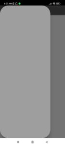
The shape constructor of drawer class is used to shape the drawer, we have used a round rectangle border class and by using the border radius constructor, we have set all the edges to have a circular shape with a value of 50. Let’s see how it looks now:
Child
 child: Container(
          height: double.infinity,
          width: double.infinity,
          color: Colors.grey,
        )
The child constructor of drawer class is used to pass any widget as the child to drawer widget. We have passed
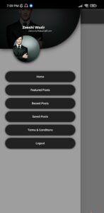
container widget with some height, width and background color. Let’s now customize it to achieve the mentioned beautiful Flutter drawer UI design.
Implementing The Drawer Design
Let’s see how to implement it.
Top Block

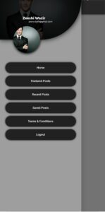
We have used a container widget and customize it in our own way, we have given it a background image and by using the color filter constructor, we have given it a shade. We also have given our bottom right edge of container a circular shape, and we have given our container a shadow as well.
Text In Top Block

We have used the text widget to show the texts in the container, we have given a
column widget as the child to the container and inside that column, we have used our text widgets.
Stack In Top Block
We have used stack widget to position the circular image container like shown in the above image.
Flutter Container Clickable Buttons
We have used a
list view builder to achieve the containers list. We also have wrapped the container with Flutter
gesture detector widget to make it clickable. We have given our containers a dark background color with a centered text. We have made a
list of names which is given below:
 List<String> categories = [

    'Home',

    'Featured Posts',

    'Recent Posts',

    'Saved Posts',

    'Terms & Conditions',

    'Logout'

  ];
As you can see a list is defined like this in Flutter dart, we have specified it like this and by using the index inside list view builder, we have used all of the names from this list.
All of the flutter widgets, like container widget, text widget, decorations, stack widget, column widget, row widget etc. are all discussed in detailed in our previous articles.
Feel free to ask if you still have any questions regarding Flutter drawer widget. We’ll be very glad to answer all.

Conclusion
That’s all for this article, hope you now have a detailed understanding of how to implement and customize Flutter drawer widget. We’ll be looking forward to receive your valuable feedback on this post. Hope to see you in our next articles in which we will dig deep into other amazing widgets. Thank you for reading it.
