In this Flutter post, we will learn how to practically use and customize Flutter positioned widget by using proper Flutter example. We will be using multiple Flutter examples to properly demonstrate the role of Flutter positioned widget.
After reading this post, I am sure you will be able to incorporate Flutter positioned widget in your Flutter apps with ease.
Outline
- What is Flutter Positioned Widget?
- Implementing Flutter Positioned Widget (Easy Examples)
- Flutter Positioned Widget Constructors
- Top Constructor
- Left Constructor
- Right Constructor
- Bottom Constructor
- Height and Width Constructors
- Customized Flutter Positioned Widget Source Code
- Conclusion
What is Flutter Positioned Widget?
As the name suggests, it is used to specify the position/place of its child widget. Let’s use a Flutter stack widget example to understand how the Flutter positioned widget works.
Implementing Flutter Positioned Widget (Easy Examples)
For that, we first have to define a simple Flutter stack widget. See below code:
Container( height: 200, width: 200, color: Colors.grey, child: Stack(children: [ Container(height: 50, width: 50, color: Colors.green), ]))
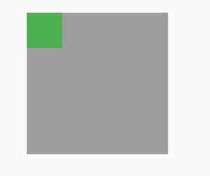
Positioned( child: Container( height: 50, width: 50, color: Colors.green))
Flutter Positioned Widget Constructors
Its constructors are listed below:
- top
- left
- right
- bottom
- height
- width
Top Constructor
It is used to specify the position of the child widget using the top border of its parent. See below code:
Positioned( top: 20, child: Container( height: 50, width: 50, color: Colors.green))
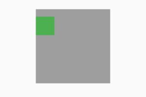
The greater the value, the more distance it will have from the top and vice versa.
Left Constructor
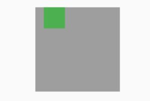
It will specify the distance from the left border of its parent widget. See below code
Positioned( left: 20, child: Container( height: 50, width: 50, color: Colors.green))
Right Constructor
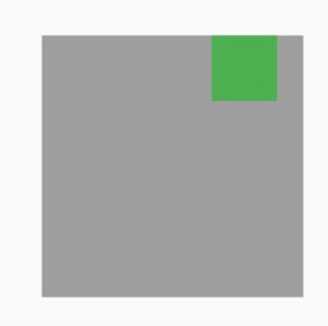
It specifies the distance/space from the right. See code below:
Positioned( right: 20, child: Container( height: 50, width: 50, color: Colors.green))
Bottom Constructor
It’s used to give space from the bottom border of the parent widget. See below code:
Positioned( bottom: 20, child: Container( height: 50, width: 50, color: Colors.green))
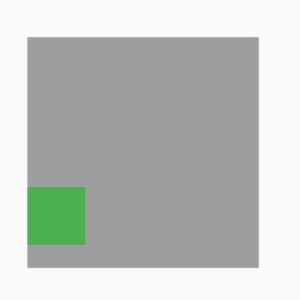
Height and Width Constructors
These are used to specify the height and width of its child widget. See below code:
Positioned( height: 30, width:80 child: Container(color: Colors.green))
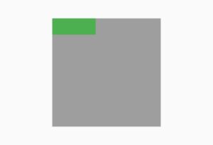
So you can use the Flutter positioned widget to specify the exact position of your widget.
I hope you now have a proper idea of how to use and customize Flutter positioned widget. I also have implemented a more customized example which is available in the below section. Don’t hesitate to ask if you still have any questions related to Flutter positioned widget. I’d love to answer all.
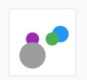
The complete source code is give below in which Flutter positioned widget is implemented and properly customized.
Customized Flutter Positioned Widget Source Code
import 'package:flutter/material.dart'; void main() { runApp(const MyApp()); } class MyApp extends StatelessWidget { const MyApp({Key? key}) : super(key: key); @override Widget build(BuildContext context) { return MaterialApp( debugShowCheckedModeBanner: false, home: Homepage(), ); } } class Homepage extends StatefulWidget { @override State<Homepage> createState() => _HomepageState(); } class _HomepageState extends State<Homepage> { @override Widget build(BuildContext context) { return SafeArea( child: Scaffold( body: Center( child: Container( height: 200, width: 200, decoration: BoxDecoration(color: Colors.white, boxShadow: [ BoxShadow( spreadRadius: 1, blurRadius: 5, color: Colors.black12) ]), child: Stack(children: [ Positioned( height: 50, width: 50, right: 20, top: 50, child: Container( decoration: BoxDecoration( shape: BoxShape.circle, color: Colors.blue), )), Positioned( height: 40, width: 40, right: 50, top: 70, child: Container( decoration: BoxDecoration( shape: BoxShape.circle, color: Colors.green), )), Positioned( height: 40, width: 40, left: 50, top: 70, child: Container( decoration: BoxDecoration( shape: BoxShape.circle, color: Colors.purple), )), Positioned( height: 80, width: 80, left: 30, bottom: 20, child: Container( decoration: BoxDecoration( shape: BoxShape.circle, color: Colors.grey), )) ]))))); } }
Conclusion
To conclude, we have used multiple examples to properly demonstrate how to use and customize Flutter positioned widget. Hope you now have learnt how to properly use it. I’d be very happy to have your comments on this post.
I’d strongly recommend my other posts for you in which amazing Flutter widgets and other topics are explained in detail and with proper Flutter examples. Thank you for reading this Flutter post.
Flutter app articles you might: Flutter appbar actions, Flutter sliverappbar, widgets in flutter, Flutter bottom navigation bar, Flutter development, Flutter books, beautiful Flutter templates, Flutter web, Flutter architecture, custom animations in Flutter, Flutter appbar title center, amazing gradient login UI, Flutter widgets, Flutter app development.
How To Easily Customize Flutter Elevated Button Width
How To Easily Implement Flutter Container Gradient
How To Easily Change Flutter Elevated Button Color
How To Design Beautiful Flutter Login Form Template – Easy Flutter Code