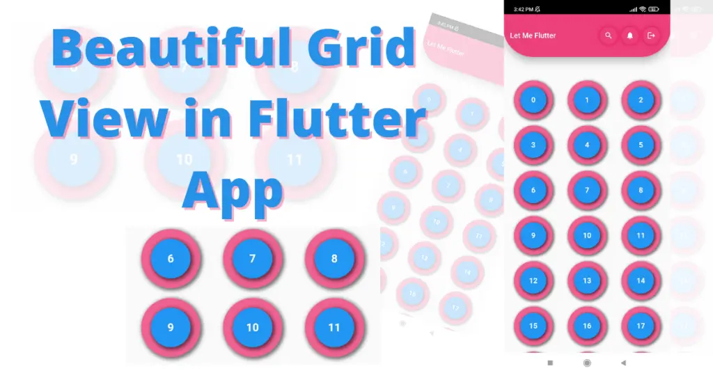
In this tutorial, we’ll learn about Flutter grid view builder in detail. What it really is, its role, and its usage in flutter apps. We’ll understand it using practical Flutter code examples to better understand it.
What is Flutter Grid View Builder?
Grid view, as the name suggests, is a grid of widgets, you give it one widget and it will build multiple widgets using its builder from that widget. Grid view is a really cool way to showcase your widgets in the flutter app. Top App bar that you see in the design, if you want to know how to implement it then we have written a complete blog on it as well. Click here to understand how it is implemented.
By the end of this article, you will be able to design the above-mentioned design in the flutter app and all the details that you would need to implement a grid view like this, so you can customize the grid view in the flutter app according to your desired requirements. Let’s start now.
Implementing Grid View Builder
GridView.builder(

        gridDelegate: SliverGridDelegateWithFixedCrossAxisCount(

            mainAxisSpacing: 5,

            crossAxisSpacing: 5,

            crossAxisCount: 3,

            childAspectRatio: 1.2),

        itemBuilder: (context, index) {

          return Container();

        },

      )
Grid view class is used for that and by using its builder function, we have implemented our grid. Using its grid delegate constructor, we can customize the size, etc. of the grid items and the number of rows as well. Let’s see how:
Extend Body Behind App Bar
extendBodyBehindAppBar: true
In our case, it is true because when you scroll then it does not show any white background app bar on the sides. I know it’s confusing but you will understand it when you test your app after compiling it.
Cross Axis Count
crossAxisCount: 3
Child Aspect Ratio
childAspectRatio: 1.2
Main Axis Spacing
mainAxisSpacing: 5
Cross Axis Spacing
crossAxisSpacing: 5
Item Count
itemCount: 10
Padding
padding: EdgeInsets.all(10).copyWith(top: 150)
As you can see we have given 10 padding to all but we want to give 150 to the top, so we can do it by using the copy with method in which the edge in the sets class extends and specify top, bottom, or other constructors values.
Item Builder
 itemBuilder: (context, index) {

          return Container(

            color: Colors.green,

          );

        },
The item builder constructor is what builds and returns the list of widgets. It has two parameters, build context and index. The index starts from 0 to infinity if you don’t specify the number of items.
In our case, we have given it a container widget. If you want to know how to customize a container then click here. It will return an infinite number of containers if we didn’t specify the item count.
Container Modifications
itemBuilder: (context, index) {

          return Container(

              alignment: Alignment.center,

              margin: EdgeInsets.all(5),

              decoration: BoxDecoration(

                  shape: BoxShape.circle,

                  color: Colors.pink.shade300,

                  boxShadow: [

                    BoxShadow(

                        color: Colors.black54,

                        spreadRadius: 2,

                        blurRadius: 4,

                        offset: Offset(2, 2))

                  ]),

              child: Container(

                  alignment: Alignment.center,

                  margin: EdgeInsets.all(15),

                  decoration: BoxDecoration(

                      shape: BoxShape.circle,

                      color: Colors.blue.shade500,

                      boxShadow: [

                        BoxShadow(

                            color: Colors.black54,

                            spreadRadius: 2,

                            blurRadius: 4,

                            offset: Offset(2, 2))

                      ]),

                  child: Text(

                    index.toString(),

                    style: TextStyle(

                        color: Colors.white,

                        fontWeight: FontWeight.bold,

                        fontSize: 20),

                  )));

        }
Let’s understand the container item that the grid view builder is returning in the flutter app. We used a margin in the container and made its shape circular. We have also given it a shadow and color. Now in its child constructor, we have given it another container with shadow, color, and margin and in that container’s child constructor, we have given it a text widget.
If you are interested in understanding how the text widget works then you can click here.
Conclusion
We hope you now have learned how to properly use the Flutter grid view builder. Don’t forget to leave your feedback in the comment section.
We’d also be glad to see you visit our other tutorials on Flutter app development and Python programming. Thank you for reading this one.
