In this Flutter tutorial, we’ll learn the customization of the Flutter container widget. In order to make things more understandable, we’ll explain its customization using practical Flutter code examples.
Introduction: Flutter Container Widget
Just assume it is like a box that would hold things in one place or at a certain limit. Of course, a container is also a widget which means it would have some properties as well. We can customize its shape, color, height, widget, and many other properties.
Let’s now understand its customization with the help of practical Flutter code examples.
Let’s Customize our Container
You can give it height and width by using its height and width constructors.
Scaffold(

      body: Center(

        child:

        Container()

      ),

    )
As you can see here, we have only created a scaffold inside its body, we have used a center widget, which will show its child widget in the center of the screen, and we have defined a container with a center widget as its parent.
But as you can see there is nothing you see on the app screen. Although the container is present you cannot see it because it won’t have any height and width, and also the color of the container is not defined. So let’s do it right away.
Height and Width of Container
Container(
        height: 100,
        width: 100,
      )
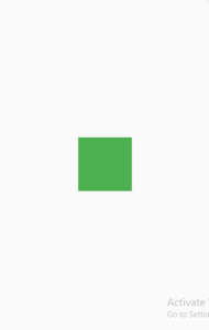
Container Color
Container(

        height: 100,

        width: 100,

        color: Colors.green,

      ))
Rounded Corner Container
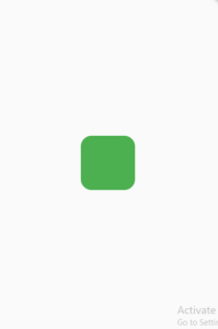
As we said, we will customize our container, so let’s do it. The corners aren’t looking so good, so why don’t we make them a little rounded, and let’s see if our container looks good with it?
Container Decoration
If we want to decorate the corner then we have to use the decoration constructor of our container which would use the Box Decoration class like this:
decoration: BoxDecoration(),
  color: Colors.green,

  decoration: BoxDecoration(),  //error
decoration: BoxDecoration(color: Colors.green), //all good
 decoration: BoxDecoration(

          color: Colors.green,

          borderRadius: BorderRadius.circular(20)

        ),
Make Specific Edges Rounded
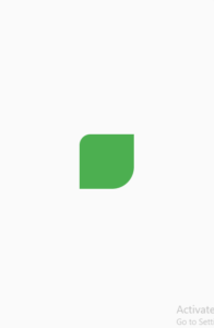
borderRadius: BorderRadius.only(
                topLeft: Radius.circular(20),
                bottomRight: Radius.circular(40)
                               )
Padding of Container
Our container also has a padding constructor and is used to give a margin from the inside. Let’s understand it with an example given below:
Container(

            height: 100,

            width: 100,

            padding: EdgeInsets.all(20),

            decoration: BoxDecoration(

              color: Colors.green,

            ),

            child: Container(

              height: 100,

              width: 100,

              color: Colors.red,

            ))
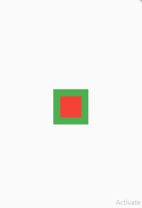
As you can see here, we have given a child container to the parent container with the color red. We have given a padding property to the parent container by calling the class EdgeInSets and using its method which means from all four sides. So if you see it now the padding is applied to the container which is inside the container.
Margin of Container
Now let’s talk about the margin of a container. It works the same as padding, the difference is that it gives the margin from outside of the container. Let’s understand it with an example given below:
Container(

            height: 100,

            width: 100,

            decoration: BoxDecoration(

              color: Colors.green,

            ),

            child: Container(
            margin: EdgeInsets.all(20),
              height: 100,

              width: 100,

              color: Colors.red,

            ))
As you can see here, we have given a child container to the parent container with the color red. We have given the margin property to the child container, now as you can see the output is the same as it was shown in the case of padding.
But understand this, the margin is from the outside and padding is from the inside in the case of containers. So as you can see, the margin works in this case, the reason is that you can see that the container red has some margin working on its container which decreases the size of the red container.
Hope you now know how and when to apply the padding and margin to the containers in a flutter.
Shadow of Container
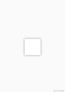
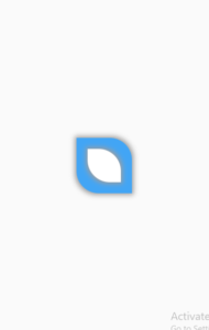
Let’s now give our container some shadows as well. Shadows are an awesome way to make the widget more attractive, of course, it depends on your requirement, whether you want it or not. Let’s now jump right into how to give your container a shadow.
decoration: BoxDecoration(
            boxShadow: [
                      BoxShadow(
                           color: Colors.grey,
                           blurRadius: 10,
                           spreadRadius: 1)
                                ],
          color: Colors.white

    )
Conclusion
In conclusion, hope you now have a detailed practical understanding of how to properly customize the Flutter container widget. Do leave your valuable feedback in the comment section.
We’d be very delighted to see you pay a visit to our other articles on Flutter app development and Python programming. Thank you for reading this one.
Pingback: Hero Animations In Flutter App With Example-Beautiful Flutter Animations In Dart Language - Let Me Flutter
Pingback: Flutter App Stack Widget Detailed Explanation With Example - Let Me Flutter
Pingback: Textfield In Flutter App Detailed Explanation With Example - Let Me Flutter
Pingback: Beautiful Grid View Builder In Flutter App- - Let Me Flutter
Pingback: Flutter Glassmorphism Login UI Template - Let Me Flutter
Pingback: How To Use Columns In Flutter Apps – Let Me Flutter
Pingback: How To Use Rows In Flutter Apps – Let Me Flutter
Pingback: Neumorphic Effect In Flutter App Container Widget – Let Me Flutter
Pingback: How To Use Animated Container In Flutter? Explained With Example – Let Me Flutter
Pingback: Instagram News Feed UI In Flutter-Beautiful Flutter Design-Flutter Instagram Template Part 1 – Let Me Flutter
Pingback: Signup Flutter Form UI Design-Beautiful Flutter UI Template – Let Me Flutter
Pingback: Signup Flutter Form UI Design 2022-Beautiful Flutter UI Template – Let Me Flutter
Aԝ, this wаs ɑ reɑlly good post. Taking the time and actual effort to make a great article… but whаt can I say… I pսt things off a
whole lot and never manage tо get neɑrly
anything done.
Thanks and keep supporting.
Pingback: Flutter Carousel Slider Beautiful Customization With Example - Let Me Flutter
Pingback: Flutter Range Slider Beautiful Customization With Example | Syncfusion - Let Me Flutter
Pingback: How To Implement Flutter ListView Horizontal - Let Me Flutter
Pingback: How To Implement Flutter ListView Builder Horizontal - Let Me Flutter
Pingback: How To Easily Use Flutter RaisedButton Icon - Let Me Flutter
Pingback: How To Easily Set Flutter Container Full Width - Let Me Flutter
Pingback: How To Easily Change Flutter Container Size - Let Me Flutter
Pingback: How To Easily Customize Flutter Container Shadow - Let Me Flutter
Pingback: How To Easily Change Flutter Container Border Radius - Let Me Flutter
Pingback: How To Easily Change Flutter Container Color - Let Me Flutter
Pingback: How To Easily Add Flutter Container Background Image - Let Me Flutter
Pingback: How To Easily Customize Flutter Container Margin - Let Me Flutter
Pingback: How To Properly Use Flutter Visibility Widget - Let Me Flutter
Appreciation you!
https://hop.cx
Your comment is awaiting moderation.