In this Flutter post, we’ll learn how to implement and customize Flutter FloatingActionButton widget. We’ll first see what the default Flutter FloatingActionButton looks like, then we’ll customize it using an easy but proper Flutter example code.
After reading this post, you’ll be able to easily implement and customize Flutter FloatingActionButton in your own apps as well.
So let’s not wait anymore and jump right into its implementation phase.
What is Flutter FloatingActionButton Widget?
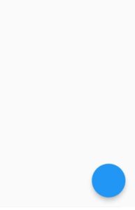
It is the widget that’ll always display on the screen, no matter if you have a listview of large amount of items or any other scrolling widget. It means even if you scroll the screen, this Flutter FloatingActionButton widget will always show on the screen.
Its default position is bottom right with some distance from the screen borders.
Let’s now understand it using proper practical example.
Default Floating Action Button Style
For that, we have to use the floating action button constructor of the scaffold widget and pass it the floating action button widget. See below code:
Scaffold(
      floatingActionButton: FloatingActionButton(
                                     onPressed: (){} )
        )
Customizing Flutter FloatingActionButton Widget (Easy Example)
Let’s now customize our floating action button using its constructors.
OnPressed
This constructor takes a function, which means you can specify any action that’ll be triggered after this floating button is pressed/clicked. These actions can be navigation to some other screen or validation of some data etc.
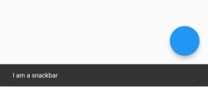
Let’s use a Flutter snackbar widget inside that function so when it’s clicked then we’ll see a snackbar on our screen.
onPressed: () {
          ScaffoldMessenger.of(context).showSnackBar(SnackBar(content: Text('I am a snackbar')));
        }
Child
child: Icon(
          Icons.add,
          size: 26,
        )

Background Color
backgroundColor: Colors.green

Elevation
elevation: 0

Shape
This constructor is used to specify the shape of floating button. See below examples:
shape: RoundedRectangleBorder(borderRadius: BorderRadius.circular(10))

shape: RoundedRectangleBorder(borderRadius: BorderRadius.circular(10).copyWith(topRight: Radius.circular(0)))

shape: RoundedRectangleBorder(borderRadius: BorderRadius.only(topLeft: Radius.circular(20),bottomRight:Radius.circular(20)))

RoundedRectangleBorder(borderRadius: BorderRadius.horizontal(left: Radius.circular(20))),

RoundedRectangleBorder(borderRadius: BorderRadius.vertical(top: Radius.circular(20))),
Mini
mini: true

This constructor makes the size of Flutter FloatingActionButton small. It takes a Boolean value and by default, it is false.

Conclusion
In conclusion, hope you now have a clear idea of Flutter FloatingActionButton widget as we’ve practically customize it with a proper example. Thank you for reading this post.

