In this Flutter tutorial, we’ll learn the concept of the Flutter range slider in detail. We’ll understand the Flutter syncfusion single slider and range slider with the help of multiple detailed Flutter code examples. So without any more delay, let’s jump right into its implementation.
What is Flutter Range Slider?
Flutter Sliders is a very beautiful and user-friendly way of getting data from users. Users just have to slide the slider to specify the particular value.
If the slider is a range slider, then the user can specify the first and last slider. For example, if some specific range of age is required then the user can slide the first point and the second point of the slider to specify the starting and ending range. So, in this way, all the age group that lies within that range will be taken. You can use it according to your project requirements.
Import Syncfusion Flutter Sliders
syncfusion_flutter_sliders: ^19.4.55

Flutter Syncfusion Sliders (Single Slider and Range Slider)
The two sliders are listed below:
- Flutter Syncfusion Range Slider
- Flutter Syncfusion Single Slider
We will explain the range slider in this article and would love to see you practice the single slider. Don’t worry, it will be implemented in the source code examples as well, so if you feel stuck then you can check it out in the source code that will be provided. Let’s now implement our syncfusion range slider in our app.
Syncfusion Range Slider
 SfRangeSlider(

                  min: 0,

                  max: 100,

                  values: SfRangeValues(0, 100),

                  onChanged: (value) {},

                )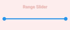
- The min constructor defines the minimum amount that the user can select.
- The max constructor defines the max amount that the user can select.
- The values constructor defines the currently selected values in the slider using the thumbs(these two small circles in the slider).
- On changed constructor is called when the user drags one of the thumbs to select a new value.
As you can see, by implementing this code, we now see a blue slider on our screen, having two thumbs that are not yet slidable, to make them slidable, we have to give dynamic values to our values constructor using the onChanged constructor.
Dynamic Values In Range Slider
SfRangeSlider(
                  min: 0,
                  max: 100,
                  values: SfRangeValues(rangeStart, rangeEnd),
                  onChanged: (value) {
                    setState(() {
                      rangeStart = value.start;
                      rangeEnd = value.end;
                    });
                  },
)Now we want to specify the values dynamically in our two variables so we have used them within the onChanged constructor and by using the argument that the onChanged function has. We can take the value of the start and end from that argument and have given it to our range start and range end.
To see this value changes in real-time, we have used the set state which rebuilds or updates the state every time it is called.
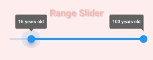
Tool Tip Of Range Slider
enableTooltip: true
Tool Tip Customization
 SfRangeSliderTheme(
                  data: SfRangeSliderThemeData(
                    tooltipBackgroundColor: Colors.white,
                    tooltipTextStyle: TextStyle(
                        color: Color(0xffF5B7B1),
                        fontSize: 12,
                        fontWeight: FontWeight.w600),
                  ),
                 child: SfRangeSlider(
                         // the slider that we are currently working on
))
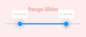
As you can see, we have wrapped our sf range slider with an sf range slider theme class. By using its data constructor, we can customize the theme data of our sf range slider.
- The tooltip background color constructor is used to change the background color of our tooltip, we have specified it to white.
- Tooltip text style constructor is used to style text that appears in the tooltip. By using it, we have customized the text color, size, and weight. You can specify different values depending on the design that you want to get.
- import ‘package:syncfusion_flutter_core/theme.dart’; Import the theme in case you don’t see it in the suggestions.
Let’s see how our tooltip looks now when we drag our slider:
Tool Tip Text Formatter Callback
tooltipTextFormatterCallback: (actualValue, formattedText) {

                      double d = actualValue;

                      return '${d.toStringAsFixed(0)} years old';

                    }
The tooltip text formatter callback constructor is used to format or change the label text of the tooltip.
- The value that is given without proper formatting is in the actual value parameter. It can be a double or a date time etc.
- The formatted text parameter stores the proper format based on the value i.e. double of date time etc.
Now when you slide the thumbs of the slider, you will see an update in the values of both thumb tooltips. The reason is that we have returned a string having the actual value and have specified the toStringAsFixed function to zero means there will be no numbers after the period(.). For instance, 2.54 will become 2.
Drag Mode
dragMode: SliderDragMode.both
- dragMode: SliderDragMode.onThumb Drag using thumb
- dragMode: SliderDragMode.betweenThumbs Drag using the slider path between the two thumbs
- dragMode: SliderDragMode.both Drag using both, either we can use thumb or the sliding path
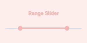
Active Color
activeColor: Color(0xffF5B7B1)
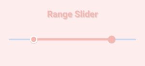
Start Thumb Icon
 startThumbIcon: Container(
                      decoration: BoxDecoration(
                          color: Colors.white, shape: BoxShape.circle),
                      child: Container(
                        decoration: BoxDecoration(
                            color: Color(0xffF5B7B1), shape: BoxShape.circle),
                        margin: EdgeInsets.all(3),
                      ),
                    )
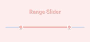
End thumb Icon
 endThumbIcon: Container(
                      decoration: BoxDecoration(
                          color: Colors.white, shape: BoxShape.circle),
                      child: Container(
                        decoration: BoxDecoration(
                            color: Color(0xffF5B7B1), shape: BoxShape.circle),
                        margin: EdgeInsets.all(3),
                      ),
                    )
Show Always Tool Tip
shouldAlwaysShowTooltip: true
Congrats, we now have achieved our mentioned design. Below is the complete source code in which implementation for both Flutter single and range sliders are specified.

Conclusion
Hope you now have detailed practical knowledge of how to implement a Flutter range slider as well as a single slider. Do feel free to deliver your valuable feedback using the comment section.
We’d also be glad to see you visit our other tutorials on Flutter app development and Python programming. Thank you for reading this one.
