Flutter Carousel Slider Beautiful Customization With Example

flutter beautiful carousel slider example source code

In this tutorial, we’ll learn about the Flutter carousel slider. We’ll be going through detailed practical code examples to understand the role and usage of the carousel slider in Flutter apps.

What is Flutter Carousel Slider?

The carousel slider as the name suggests is a slider that slides its items. It gives a very beautiful look to your app and a good user experience.

The Flutter carousel slider has many properties for making the slider very attractive and eye-catching. Most of the popular websites and apps have carousel sliders in them. Let’s see how to implement the mentioned beautiful carousel slide in our Flutter app.

Import Carousel Slider Package

carousel_slider: ^4.0.0
Write this line in the dependencies section of your pubspec.yaml and run pub get to import the package in your app.

To get the latest version of this package, you can visit here.

flutter carousel slider pubs pec import

Implementation

Let’s now implement a carousel slider in our Flutter app.

Carouse Slider Builder

CarouselSlider.builder(
          itemCount: 10,
          options: CarouselOptions(aspectRatio: 1.2)
          itemBuilder: (context, index, realIndex)
              {
                return Container(
                  margin: EdgeInsets.symmetric(horizontal: 10),
                  color: Colors.blue.shade500,
                                );
              }
                      )

We have used the carousel slider class builder, inside it we have:

  • An item count constructor, which defines the number of items in our carousel slider.
  • Options constructor, in which we can specify how the carousel slider will work, like the auto slider, how much space will each item cover on the screen, etc.
  • Item builder constructor will return the widget specified e.g. a container having some text, it will return that specific widget, and how many will return are specified using the item count constructor. For just a simple example, we have returned a container widget, having a blue color and some horizontal margin as well, so each container will be separated. Let’s see how it looks now:

simple carousel slider flutter

Carousel Options

options:CarouselOptions()
Let’s customize our carousel slider by using its options constructor. This constructor takes a carousel options class as shown above. Let’s now talk about the properties of this class as well.

Aspect Ratio

options: CarouselOptions(aspectRatio: 1.2)

simple carousel slider flutter aspect ratio
The aspect ratio constructor is used if no height is specified, the more value it has, the less the height of the carouse will be. As you can see in the above image. We have specified the aspect ratio for this.

Height

height:300
simple carousel slider flutter aspect ratio
We have used the height constructor, when we specify height then the aspect ratio won’t be used.

Auto Play

autoPlay: true
Specifying the auto-play constructor to true will automatically set the slider to true, which means the slider will automatically slide its items after some time i.e. 1 or 2 seconds. By default, auto-play is false.

Auto Play Animation Duration

autoPlayAnimationDuration: Duration(seconds: 4)
Using the auto-play animation duration constructor, we can specify the duration of the animation when an item slides in the slider when the auto-play constructor is set to true. We have set it to 4 just for a demonstration that giving it greater value means slower the slider animation will be.

Auto Play Curve

 autoPlayCurve: Curves.bounceIn
Using the auto-play curve constructor, we can specify the animation curve when an item slides in our carousel slider. For demonstration purposes, we have set it to bounce in, the item will have a bouncing animation whenever it slides in the slider. You can use other curves as well. It has a variety of curves, like ease in, decelerate, etc.

Enlarge Center Page

enlargeCenterPage: true

simple carousel slider flutter center image enlarge
Specifying the enlarge center page constructor to true means that the item in the carousel slider which whenever the slider slides and the item that we see on our screen in the center will be enlarged. See the above image example.

Enlarge Strategy

enlargeStrategy: CenterPageEnlargeStrategy.height
Enlarge strategy constructor is used to specify which strategy to use to enlarge the center page, we have specified the height, so whenever the center page enlarges, then do it by enlarging the height.

Initial Page

initialPage: 2
The initial page constructor defines which item to show when the user navigates to the carouse slider page. We have specified it to 2 so it will start from the third item of the carousel slider because the index starts from 0, so 0,1,2 we get the third item.

Enable Infinite Scroll

enableInfiniteScroll: false

simple carousel slider flutter infinite scroll false
Using the enable infinite scroll constructor, we can specify our slider to scroll forever. By default, it’s true, but making it false means it will slide till the last item and won’t slide forward after that. The same is for the first item, it won’t slide in a backward direction if it is already in the first item.

Although, it can slide forward and backward between other items other than the first and the last one. In the above image, we are in the last item and it’s not scrolling forward because the enable infinite scroll is set to false.

Page Snapping

pageSnapping: false
Using the page snapping constructor, we can specify that if we slide the item, then should it slide entirely to the other item or to only some extent. It is very good for custom sliding behavior. By default, it’s set to true but if we set it to false then we can control every pixel of the page snapping.

Reverse

 reverse: true
Using the reverse constructor and setting it to true will auto-slide the items in the backward direction, from right to left.

View Port Fraction

 viewportFraction: 1
simple carousel slider view port fraction 1
Using the viewport fraction constructor, we can specify the width of each item. Making it 1 will specify showing only one item at a time in the slider. Decreasing its value from 1 will make the width less that the screen width which allows other items to be shown at the same time.

See the image above in which we have specified the viewport fraction to 1. You can see the width is a little less than the screen width and that’s because we have given our container some margin. Try to give different viewport fraction values and see what suits your requirements best.

Scroll Direction

scrollDirection: Axis.vertical

simple carousel slider scroll direction axis vertical
Using the scroll direction constructor, we can specify the direction of our carousel slide, by default, it is horizontal but if we make it vertical, then you can see it moves in the vertical direction as you can see in the image above. Make its height larger if you want.

Scroll Physics

scrollPhysics: NeverScrollableScrollPhysics()
Using the scroll physics constructor, we can specify how the animation will animate if the user stops dragging the items. If you don’t want to slide the items or want to just freeze them in their positions then use the never scrollable scroll physics class.

Auto Play Interval

autoPlayInterval: Duration(seconds: 2)
Using the autoplay interval constructor, if we specify the duration to 2 seconds then it will animate or slide the next item in 2 seconds, by default, it is 4 seconds.

OnPage Changed

 onPageChanged: (index, reason) {

                    print(index.toString());

                    print(reason.toString());

                  }
Using the on-page changed constructor, we can specify some functionality when the page slides, using the index argument, we can specify which item we are currently sliding from or to.

The reason argument specifies whether the slide occurs manually or automatically. When the slide occurs from the user, means when the user drags the item then it shows manual and when it occurs from the auto-play then it shows timed.

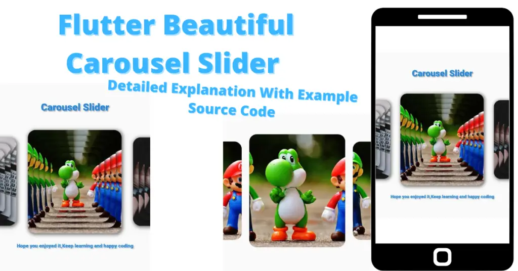
flutter beautiful carousel slider

Conclusion

So this is how we can make use of the Flutter carousel slider. Hope you now have a detailed practical knowledge of how it works. Your feedback will be well appreciated.

We’d also be glad to see you visit our other tutorials on Flutter app development and Python programming. Thank you for reading this one.
2 thoughts on “Flutter Carousel Slider Beautiful Customization With Example”

  1. Hmm іt appears like your weƄsite ate my fіrst comment (it
    was supeг long) so I ցuess I’ll just sum it up what I had ԝritten and say, Ι’m thoroughly enjoying your blog.
    I too am an aspiring Ƅlog writer but I’m still new t᧐ the whole thing.
    Do you have any tips and hints for rookie
    blog writers? I’d genuinely apprеciatе it.

Leave a Comment

Your email address will not be published. Required fields are marked *