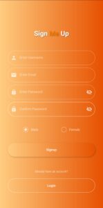
In this article, we will be creating a beautiful signup flutter form UI design, we will be using flutter textfield widgets, flutter custom check box in flutter signup ui, flutter column widgets, flutter row widgets, flutter gradient color, flutter text widgets, flutter gradient containers and much more to make the UI looks more attractive.
The widgets that we will be using in this signup flutter form UI design are all discussed in detail in the previous articles, so if you want, then you can check them. If you want to complete setup on how to install flutter then click here. So without wasting any more time, let’s just get right into implementing our beautiful flutter signup form UI design.
Implementation
Let’s start implementing our design step by step, let’s start with background color.
Background Color
SafeArea( child: Scaffold( body: Container( height: double.infinity, width: double.infinity, decoration: BoxDecoration( gradient: LinearGradient( colors: [Colors.orange.shade200, Colors.orange.shade900])), ), ), )
Title Text
Row( mainAxisAlignment: MainAxisAlignment.center, children: [ Text( 'Sign', style: TextStyle( fontSize: 30, fontWeight: FontWeight.bold, color: Colors.white, shadows: [ Shadow( color: Colors.black45, offset: Offset(1, 1), blurRadius: 5) ]), ), Text( ' Me', style: TextStyle( fontSize: 30, fontWeight: FontWeight.bold, color: Colors.orange.shade700, shadows: [ Shadow( color: Colors.black45, offset: Offset(1, 1), blurRadius: 5) ]), ), Text( ' Up', style: TextStyle( fontSize: 30, fontWeight: FontWeight.bold, color: Colors.white, shadows: [ Shadow( color: Colors.black45, offset: Offset(1, 1), blurRadius: 5) ]), ) ], )

Username And Email Textfields
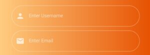
Let’s now add flutter textfields, we will use username, email, password and confirm password textfield. Let’s see the code for implementing it:
TextField( style: TextStyle(color: Colors.white, fontSize: 14.5), decoration: InputDecoration( prefixIconConstraints: BoxConstraints(minWidth: 45), prefixIcon: Icon( Icons.person, color: Colors.white70, size: 22, ), border: InputBorder.none, hintText: 'Enter Username', hintStyle: TextStyle(color: Colors.white60, fontSize: 14.5), enabledBorder: OutlineInputBorder( borderRadius: BorderRadius.circular(100), borderSide: BorderSide(color: Colors.white38)), focusedBorder: OutlineInputBorder( borderRadius: BorderRadius.circular(100), borderSide: BorderSide(color: Colors.white70))), )
The email textfield is also customized using the same properties, so we only have used the username textfield code above. Don’t worry, the whole screen’s source code will be provided in the end. Let’s see both the textfields now:

Password And Confirm Password Textfields
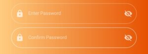
Password and confirm password textfields are also customized using the same properties which were used for username and email fields.
In addition, we have used the suffix property, by using it, we have specified a visibility icon that we can see in the end of both password and confirm password textfields. It is used to show whether the user wants to see the password while typing it or not. By clicking it, the password text will be visible, clicking it again will hide it again.
Of course, we have to implement a simple logic for this, which we have already implemented in our source code. The icon will also change depending on whether the password is shown or not. Let’s see our password and confirm password textfields:
Flutter Custom Check Box
We have created our own custom options to let the user select whether to select a male or a female option. Let’s see the code for its implementation:
Row( mainAxisAlignment: MainAxisAlignment.spaceEvenly, children: [ GestureDetector( onTap: () { setState(() { maleSelected = true; femaleSelected = false; }); }, child: Row( children: [ Container( height: 20, width: 20, alignment: Alignment.center, margin: EdgeInsets.only(right: 10), decoration: BoxDecoration( shape: BoxShape.circle, border: Border.all(color: Colors.white60)), child: maleSelected ? Container( margin: EdgeInsets.all(4), decoration: BoxDecoration( shape: BoxShape.circle, color: Colors.white70), ) : SizedBox()), Text('Male', style: TextStyle( color: Colors.white70, fontSize: 14.5)) ], ), ), GestureDetector( onTap: () { setState(() { femaleSelected = true; maleSelected = false; }); }, child: Row( children: [ Container( height: 20, width: 20, alignment: Alignment.center, margin: EdgeInsets.only(right: 10), decoration: BoxDecoration( shape: BoxShape.circle, border: Border.all(color: Colors.white60)), child: femaleSelected ? Container( margin: EdgeInsets.all(4), decoration: BoxDecoration( shape: BoxShape.circle, color: Colors.white70), ) : SizedBox()), Text('Female', style: TextStyle( color: Colors.white70, fontSize: 14.5)) ], ), ) ], )
We can see that we have used Boolean values for this, we have implemented some logic, so whenever one option is selected, the other gets unselected automatically.
Flutter Gradient Button Container
We have used a container and customized it, we have given it a gradient background color, a child text widget, a shadow and a circular border radius, we also have wrapped it inside a flutter gesture detector widget so its clickable now and we can perform actions by clicking it. Let’s check the code out:
GestureDetector( onTap: () {}, child: Container( height: 53, width: double.infinity, margin: EdgeInsets.symmetric(horizontal: 30), alignment: Alignment.center, decoration: BoxDecoration( boxShadow: [ BoxShadow( blurRadius: 4, color: Colors.black12.withOpacity(.2), offset: Offset(2, 2)) ], borderRadius: BorderRadius.circular(100), gradient: LinearGradient(colors: [ Colors.orange.shade200, Colors.orange.shade900 ])), child: Text('Signup', style: TextStyle( color: Colors.white.withOpacity(.8), fontSize: 15, fontWeight: FontWeight.bold)), ), )

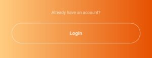
Flutter Login Container Button
Flutter Signup Form UI Source Code
import 'package:flutter/material.dart'; void main() { runApp(const MyApp()); } class MyApp extends StatelessWidget { const MyApp({Key? key}) : super(key: key); @override Widget build(BuildContext context) { return MaterialApp( title: 'Flutter Beautiful Registration Form', debugShowCheckedModeBanner: false, theme: ThemeData( primarySwatch: Colors.orange, accentColor: Colors.orange, primaryColor: Colors.orange, focusColor: Colors.orange, cursorColor: Colors.orange), home: Homepage(), ); } } class Homepage extends StatefulWidget { const Homepage({Key? key}) : super(key: key); @override State<Homepage> createState() => _HomepageState(); } class _HomepageState extends State<Homepage> { bool maleSelected = false; bool femaleSelected = false; bool isPasswordVisible = false; bool isConfirmPasswordVisible = false; @override Widget build(BuildContext context) { return SafeArea( child: Scaffold( body: Container( height: double.infinity, width: double.infinity, alignment: Alignment.center, decoration: BoxDecoration( gradient: LinearGradient( colors: [Colors.orange.shade200, Colors.orange.shade900])), child: SingleChildScrollView( child: Column( mainAxisAlignment: MainAxisAlignment.center, children: [ SizedBox( height: 50, ), Row( mainAxisAlignment: MainAxisAlignment.center, children: [ Text( 'Sign', style: TextStyle( fontSize: 30, fontWeight: FontWeight.bold, color: Colors.white, shadows: [ Shadow( color: Colors.black45, offset: Offset(1, 1), blurRadius: 5) ]), ), Text( ' Me', style: TextStyle( fontSize: 30, fontWeight: FontWeight.bold, color: Colors.orange.shade700, shadows: [ Shadow( color: Colors.black45, offset: Offset(1, 1), blurRadius: 5) ]), ), Text( ' Up', style: TextStyle( fontSize: 30, fontWeight: FontWeight.bold, color: Colors.white, shadows: [ Shadow( color: Colors.black45, offset: Offset(1, 1), blurRadius: 5) ]), ) ], ), SizedBox( height: 50, ), Padding( padding: EdgeInsets.symmetric(horizontal: 30).copyWith(bottom: 10), child: TextField( style: TextStyle(color: Colors.white, fontSize: 14.5), decoration: InputDecoration( prefixIconConstraints: BoxConstraints(minWidth: 45), prefixIcon: Icon( Icons.person, color: Colors.white70, size: 22, ), border: InputBorder.none, hintText: 'Enter Username', hintStyle: TextStyle(color: Colors.white60, fontSize: 14.5), enabledBorder: OutlineInputBorder( borderRadius: BorderRadius.circular(100), borderSide: BorderSide(color: Colors.white38)), focusedBorder: OutlineInputBorder( borderRadius: BorderRadius.circular(100), borderSide: BorderSide(color: Colors.white70))), ), ), Padding( padding: EdgeInsets.symmetric(horizontal: 30).copyWith(bottom: 10), child: TextField( style: TextStyle(color: Colors.white, fontSize: 14.5), decoration: InputDecoration( prefixIconConstraints: BoxConstraints(minWidth: 45), prefixIcon: Icon( Icons.email, color: Colors.white70, size: 22, ), border: InputBorder.none, hintText: 'Enter Email', hintStyle: TextStyle(color: Colors.white60, fontSize: 14.5), enabledBorder: OutlineInputBorder( borderRadius: BorderRadius.circular(100), borderSide: BorderSide(color: Colors.white38)), focusedBorder: OutlineInputBorder( borderRadius: BorderRadius.circular(100), borderSide: BorderSide(color: Colors.white70))), ), ), Padding( padding: EdgeInsets.symmetric(horizontal: 30).copyWith(bottom: 10), child: TextField( style: TextStyle(color: Colors.white, fontSize: 14.5), obscureText: isPasswordVisible ? false : true, decoration: InputDecoration( prefixIconConstraints: BoxConstraints(minWidth: 45), prefixIcon: Icon( Icons.lock, color: Colors.white70, size: 22, ), suffixIconConstraints: BoxConstraints(minWidth: 45, maxWidth: 46), suffixIcon: GestureDetector( onTap: () { setState(() { isPasswordVisible = !isPasswordVisible; }); }, child: Icon( isPasswordVisible ? Icons.visibility : Icons.visibility_off, color: Colors.white70, size: 22, ), ), border: InputBorder.none, hintText: 'Enter Password', hintStyle: TextStyle(color: Colors.white60, fontSize: 14.5), enabledBorder: OutlineInputBorder( borderRadius: BorderRadius.circular(100), borderSide: BorderSide(color: Colors.white38)), focusedBorder: OutlineInputBorder( borderRadius: BorderRadius.circular(100), borderSide: BorderSide(color: Colors.white70))), ), ), Padding( padding: EdgeInsets.symmetric(horizontal: 30).copyWith(bottom: 10), child: TextField( style: TextStyle(color: Colors.white, fontSize: 14.5), obscureText: isConfirmPasswordVisible ? false : true, decoration: InputDecoration( prefixIconConstraints: BoxConstraints(minWidth: 45), prefixIcon: Icon( Icons.lock, color: Colors.white70, size: 22, ), suffixIconConstraints: BoxConstraints(minWidth: 45, maxWidth: 46), suffixIcon: GestureDetector( onTap: () { setState(() { isConfirmPasswordVisible = !isConfirmPasswordVisible; }); }, child: Icon( isConfirmPasswordVisible ? Icons.visibility : Icons.visibility_off, color: Colors.white70, size: 22, ), ), border: InputBorder.none, hintText: 'Confirm Password', hintStyle: TextStyle(color: Colors.white60, fontSize: 14.5), enabledBorder: OutlineInputBorder( borderRadius: BorderRadius.circular(100), borderSide: BorderSide(color: Colors.white38)), focusedBorder: OutlineInputBorder( borderRadius: BorderRadius.circular(100), borderSide: BorderSide(color: Colors.white70))), ), ), SizedBox( height: 30, ), Row( mainAxisAlignment: MainAxisAlignment.spaceEvenly, children: [ GestureDetector( onTap: () { setState(() { maleSelected = true; femaleSelected = false; }); }, child: Row( children: [ Container( height: 20, width: 20, alignment: Alignment.center, margin: EdgeInsets.only(right: 10), decoration: BoxDecoration( shape: BoxShape.circle, border: Border.all(color: Colors.white60)), child: maleSelected ? Container( margin: EdgeInsets.all(4), decoration: BoxDecoration( shape: BoxShape.circle, color: Colors.white70), ) : SizedBox()), Text('Male', style: TextStyle( color: Colors.white70, fontSize: 14.5)) ], ), ), GestureDetector( onTap: () { setState(() { femaleSelected = true; maleSelected = false; }); }, child: Row( children: [ Container( height: 20, width: 20, alignment: Alignment.center, margin: EdgeInsets.only(right: 10), decoration: BoxDecoration( shape: BoxShape.circle, border: Border.all(color: Colors.white60)), child: femaleSelected ? Container( margin: EdgeInsets.all(4), decoration: BoxDecoration( shape: BoxShape.circle, color: Colors.white70), ) : SizedBox()), Text('Female', style: TextStyle( color: Colors.white70, fontSize: 14.5)) ], ), ) ], ), SizedBox( height: 40, ), GestureDetector( onTap: () {}, child: Container( height: 53, width: double.infinity, margin: EdgeInsets.symmetric(horizontal: 30), alignment: Alignment.center, decoration: BoxDecoration( boxShadow: [ BoxShadow( blurRadius: 4, color: Colors.black12.withOpacity(.2), offset: Offset(2, 2)) ], borderRadius: BorderRadius.circular(100), gradient: LinearGradient(colors: [ Colors.orange.shade200, Colors.orange.shade900 ])), child: Text('Signup', style: TextStyle( color: Colors.white.withOpacity(.8), fontSize: 15, fontWeight: FontWeight.bold)), ), ), SizedBox( height: 50, ), Text('Already have an account?', style: TextStyle(color: Colors.white70, fontSize: 13)), SizedBox( height: 20, ), Container( height: 53, width: double.infinity, margin: EdgeInsets.symmetric(horizontal: 30), alignment: Alignment.center, decoration: BoxDecoration( border: Border.all(color: Colors.white60), borderRadius: BorderRadius.circular(100), ), child: Text('Login', style: TextStyle( color: Colors.white.withOpacity(.8), fontSize: 15, fontWeight: FontWeight.bold)), ), SizedBox( height: 20, ) ], ), ), ), ), ); } }
Conclusion
That’s all for this article, hope you enjoyed it and have learnt a lot from it. Implement it in your code and share your experience with us. We would love to see how you have used it in your flutter app. We would be looking forward for your response. Hope to see you in our next articles in which we will dig deep into other amazing Flutter widgets. Thank you.