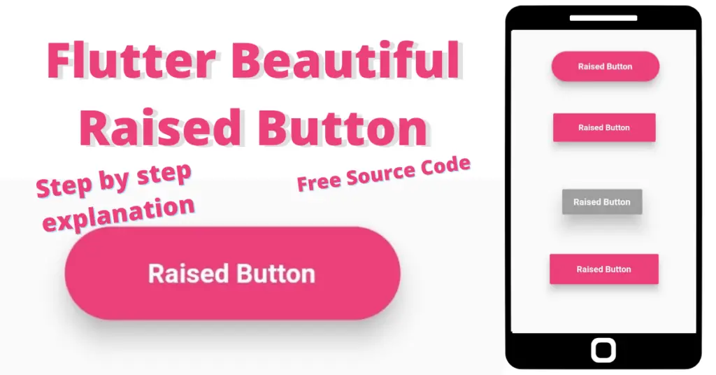
In this article, we will discuss flutter raised button in detail, how we can change the flutter raised button size, how can we implement raised button decoration, flutter raised button style implementation, how to customize flutter raised button height, the usage and implementation of raised button onpressed function by using a flutter raised button example, but first if you are new and want a complete setup and want to build your first app instantly, then click here, now let’s jump into raised button.
Introduction: Flutter Raised Button
Flutter raised button, as the name suggests, its a button with some shadow to give it an elevated effect. Let’s discuss how to implement it and customize our flutter raised button using the raised button class.
Implementation
RaisedButton(
        onPressed: () {}
            )
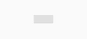
We have used a raised button class to implement our flutter raised button. We have used the flutter raised button onpressed constructor in which we can specify some actions/functions which will trigger after we tap on the flutter raised button. Let’s see how our flutter raised button looks now:
As you can see, there is a grey colored button having some shadow. Now let’s add some text and decoration to make it attractive.
Flutter Raised Button Child
 child: Text(
          'Raised Button',
          style: TextStyle(
              color: Colors.black54,
              fontWeight: FontWeight.bold,
              fontSize: 15
                          )
             )
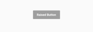
By using the child constructor of the raised button class, we have implemented a text widget. We have given the text some color, size etc. We can see it in the above image how our text is looking in the raised button.
Color
color: Colors.pink.shade400
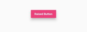
Using the color constructor of raised button class, we can change the background color of the raised button. As for demonstration purpose, we have specified the color to pink. Let’s see how it looks:
Text Color
textColor: Colors.white
Text color constructor of raised button class is used to give color to the child text of the raised button. If you remove the color from the text style in the above example and specify the text color with some color then you will see that the color of the text is same as specified by the text color constructor.
Disabled Color
disabledColor: Colors.grey,

onPressed: null
The constructor disabled color of raised button class is used to specify the color of button when it is disabled, to make the button disable, just pass null to the onpressed constructor of raised button class. We have used grey color and it will be shown when the button is disabled. Now let’s see how our disabled button looks right now:
Elevation
elevation: 10
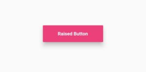
The elevation constructor is used to make the button look elevated by spreading the flutter raised button shadow. By default it it little less but we have specified it to 10. Let’s see how our button looks now:
Disabled Elevation
disabledElevation: 20
Disabled elevation constructor is used to give elevation to the disabled flutter raised button. We have set the elevation to 20. Just by passing null to the onpressed constructor will result in showing the disabled elevation. Let’s look at it in the below image:
On Long Press
onLongPress: () {
          print("long pressed");
                 }
On long press constructor is triggered when the user long presses on the raised button.
Padding
padding: EdgeInsets.symmetric(horizontal: 40, vertical: 15)
Padding constructor of raised button is used to implement padding from inside the button, it can be used to increase of decrease the height or width of button. We have specified some padding. Let’s see how our button looks now:
Shape
shape: RoundedRectangleBorder(borderRadius: BorderRadius.circular(50))
Shape constructor of raised button class is used to customize the corners/shape of the raised button. We have used a round rectangle border class and by using its border radius constructor, we have made all four edges circular with a value of 50. Let’s see the shape of our flutter button now:
Splash Color
splashColor: Colors.green
Splash color constructor is used when we want to show a color when the user presses or long press the raised button. We have specified the splash color to green so whenever the button will be pressed or long pressed then a green splash color animation will appear on the button. Now we have understand how to customize a raised button in our flutter app. We would love you to play with other constructors of raised button as well and comment us your experience with them.
Conclusion
That’s all for this article, hope you enjoyed it and have learnt a lot from it. Implement it in your code and share your experience with us. We would love to see how you have used it in your flutter app. We would be looking forward for your response. Hope to see you in our next articles in which we will dig deep into other amazing widgets. Thanks for reading.
