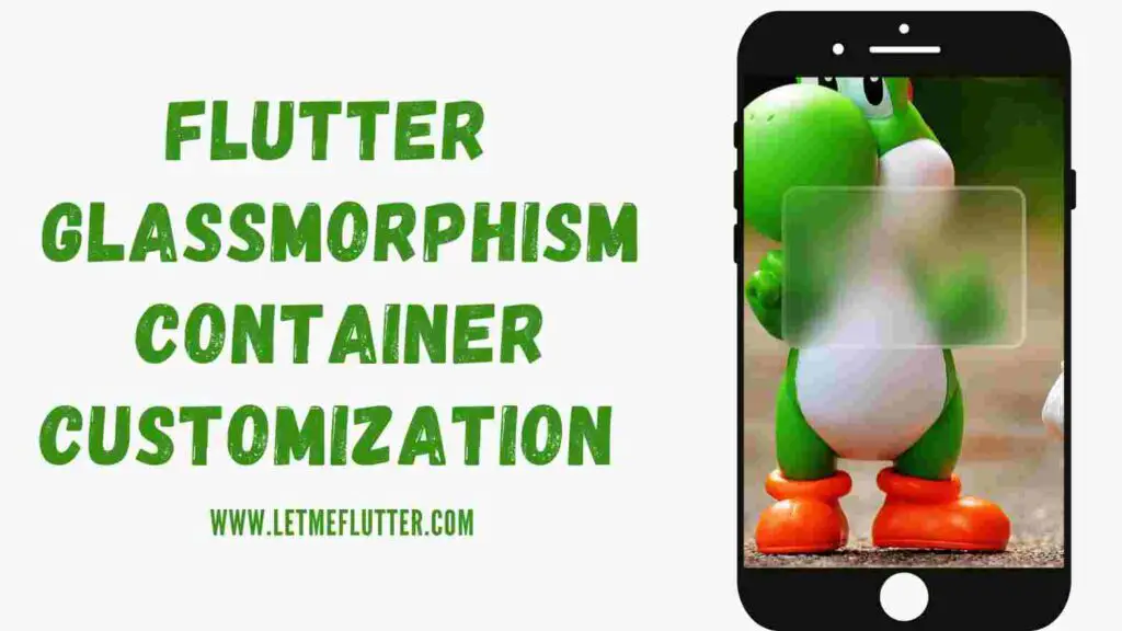
In this Flutter post, we will see how to use and customize Flutter glassmorphism container with the help of an easy Flutter example. We will be practically customizing Flutter glassmorphism container with step by step explanation for better understanding. So let’s start understanding the role and usage of Flutter glassmorphism container.
What is Flutter Glassmorphism Container?
Flutter glassmorphism container is used to show a container with glass effect. We will understand it using proper Flutter example.
Implementing Flutter Glassmorphism Container
In order to use Flutter glassmorphism container in your Flutter app, you have to import the glassmorphism package first. Click here to understand how to import it.
Now let’s use and customize the Flutter glassmorphism container step by step:

- We have given a container to the scaffold body and have given it a width and height of double.infinity to cover the whole screen. We also have given that container a background image.
- After that, we have used a Flutter glassmorphic container widget as a child to the above mentioned container.
- This glassmorphic container widget has a width and height constructor in which we have passed some value so we can see the Flutter glassmorphism container in our screen.
- The border radius constructor is used to make the edges of the container rounded.
- Linear gradient constructor is used to show a gradient color as a background of this Flutter glassmorphism container. It takes a linear gradient class. In our case, we have just used the colors constructor of the linear gradient class. This constructor takes a list of colors, so we have passed two colors to it.
- Border constructor of Flutter glassmorphism container widget specified the thickness of container’s border. We have passed a value 5 to it so to see the border clearly.
- Blur constructor is used to specify how much blur the Flutter glassmorphism container should look. Lesser value means less blur.
- Border gradient is used to give a gradient color to the border of Flutter glassmorphism container. You can specify it with the same process as used for the linear gradient constructor mentioned above.
That’s all for the boring theory part. Let’s now see a proper practical code. Below is the complete source code in which the above theory part is implemented practically.
Flutter Glassmorphism Container Customization Source Code

import 'package:flutter/material.dart';
import 'package:glassmorphism/glassmorphism.dart';
void main() {
  runApp(const MyApp());
}
class MyApp extends StatelessWidget {
  const MyApp({Key? key}) : super(key: key);
  @override
  Widget build(BuildContext context) {
    return MaterialApp(
      debugShowCheckedModeBanner: false,
      home: Homepage(),
    );
  }
}
class Homepage extends StatefulWidget {
  @override
  State<Homepage> createState() => _HomepageState();
}
class _HomepageState extends State<Homepage> {
  @override
  Widget build(BuildContext context) {
    return SafeArea(
        child: Scaffold(
            body: Container(
                height: double.infinity,
                width: double.infinity,
                decoration: BoxDecoration(
                    image: DecorationImage(
                        fit: BoxFit.cover,
                        image: AssetImage('assets/cartoon.jpg'))),
                child: Center(
                  child: GlassmorphicContainer(
                    width: 300,
                    height: 200,
                    borderRadius: 20,
                    linearGradient: LinearGradient(
                        colors: [Colors.white10, Colors.white10]),
                    border: 5,
                    blur: 10,
                    borderGradient: LinearGradient(
                        colors: [Colors.white10, Colors.white30]),
                  ),
                ))));
  }
}
Conclusion
To conclude, hope you now have a detailed practical understanding of how to use and customize Flutter glassmorphism container with ease. Your feedback would be appreciated. Thank you for reading.
