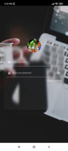
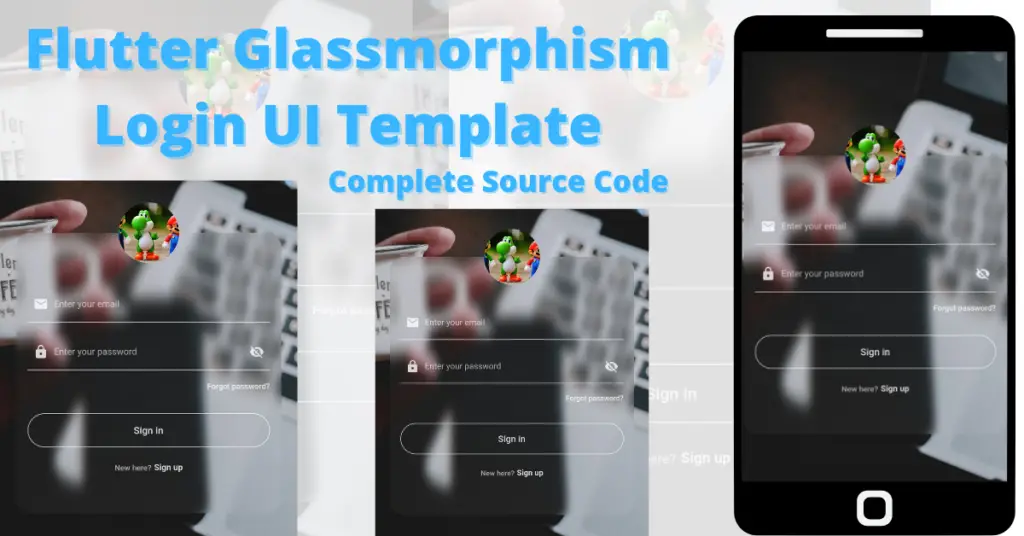
Let’s talk about developing the mentioned Flutter glassmorphism login UI in the Flutter app. Everything about the glass morphic effect in Flutter will be discussed with the help of practical code examples for better understanding.
Flutter Glassmorphism Login UI
It specifies a glass-type effect. In Flutter, we can achieve it by using the glassmorphism package. We will be covering each and every detail on how to make this glassmorphism login a beautiful template. Let’s see what we have used in it.
Glassmorphism Package
We have used a glassmorphism package to get the glass container that we have used on our login page. To implement it first import the package using the pubspec.yaml.
glassmorphism: ^3.0.0
Get the latest version and use it in the dependencies section, as shown in the image above, then run pug get to import the package in your app. Click here to check the latest version.
Glassmorphic Login UI Steps Explanation
Background Image
 Scaffold(
        body: Container(
          height: double.infinity,
          width: double.infinity,
          decoration: BoxDecoration(
              image: DecorationImage(
                  fit: BoxFit.cover,
                  image: AssetImage('assets/development.jpg')))
          )
As you can see, we have used a scaffold, and in its body constructor, we have used a container, inside that container’s box decoration, we have specified an image. First, you have to make an asset folder in your app, then paste the image there and then specify the location in pubspec.yaml like shown below:

Glassmorphism Container And Top Circular Image
Align(
                  alignment: Alignment.topCenter,
                  child: Container(
                    height: 80,
                    width: 80,
                    decoration: BoxDecoration(
                        shape: BoxShape.circle,
                        image: DecorationImage(
                            fit: BoxFit.cover,
                            image: AssetImage('assets/cartoon.jpg'))),
                  ),

                )
By implementing this we can see a circular image stacked on top of the glass morphic container. We have used a container, then in its child constructor, we have used a stack widget.
In its first child, we have used a glass morphic container, in which we will define our email, password, forgot password, login clickable container, and sign up clickable text.
In the second child, we used a container and have given it an image by using its image decoration constructor of the box decoration class, we can see a circular image on top of our glass container. Click here to learn how to implement stack widgets properly. Let’s see how the glass morphic container is implemented:
GlassmorphicContainer(
                    width: 350,
                    height: 370,
                    borderRadius: 20,
                    blur: 5,
                    alignment: Alignment.bottomCenter,
                    border: 2,
                    linearGradient: LinearGradient(
                      begin: Alignment.topLeft,
                      end: Alignment.bottomRight,
                      colors: [
                        Color(0xFFffffff).withOpacity(0.01),
                        Color(0xFFFFFFFF).withOpacity(0.05),
                      ],
                    ),
                    borderGradient: LinearGradient(
                      colors: [
                        Color(0xFFffffff).withOpacity(0),
                        Color((0xFFFFFFFF)).withOpacity(0),
                      ],
                    ),)
We have used the glassmorphic container class:
- We have given the container height and width using its height, and width constructors.
- We have used the border-radius constructor to make the edges of the container rounded.
- We have used a blur constructor to blur the background of the container, high values mean a more blurred background.
- For gradients, we have used the linear gradient constructor, for giving gradients to the border, use the border gradient constructor. In the linear gradient class, we have used the colors constructor and given it two colors of different values.
By implementing this, we can now see a glass effect container in our screen. Let’s see how it looks now:

Email and Password Textfield
 TextField(
                            style: TextStyle(
                                color: Colors.white.withOpacity(.8),
                                fontSize: 14),
                            decoration: InputDecoration(
                                enabledBorder: UnderlineInputBorder(
                                    borderSide:
                                        BorderSide(color: Colors.white70)),
                                prefixIcon: Icon(
                                  Icons.email,
                                  color: Colors.white.withOpacity(.8),
                                  size: 20,
                                ),
                                prefixIconConstraints:
                                    BoxConstraints(minWidth: 35),
                                hintText: 'Enter your email',
                                hintStyle: TextStyle(
                                    color: Colors.white60, fontSize: 14)),
                          ),

We have used a column widget and inside it, we have used an email and password textfield. We have also used a forgot password text below the password textfield.
Sign In Container And Sign Up Text
                            height: 45,
                            width: 320,
                            alignment: Alignment.center,
                            decoration: BoxDecoration(
                                borderRadius: BorderRadius.circular(60),
                                border: Border.all(color: Colors.white70)),
                            child: Text(
                              'Sign in',
                              style: TextStyle(
                                  fontSize: 15,
                                  color: Colors.white.withOpacity(.8),
                                  fontWeight: FontWeight.w500),
                            ),
                          ))

Below this container, we have used a row of two text widgets, the first one shows a simple text which is ‘new here?’ while the second one is a text which shows ‘sign up’. We have made the signup text clickable using the Flutter gesture detector class. Just like we made the sign-in container clickable by wrapping it with a gesture detector widget.
This is the final design that we have implemented. Hope you now understand the complete process.
Conclusion
In conclusion, hope you now have a complete understanding of how to create a Flutter glassmorphism login UI. Don’t forget to leave your feedback in the comment block.
We’d also be glad to see you visit our other tutorials on Flutter app development and Python programming. Thank you for reading this one.
