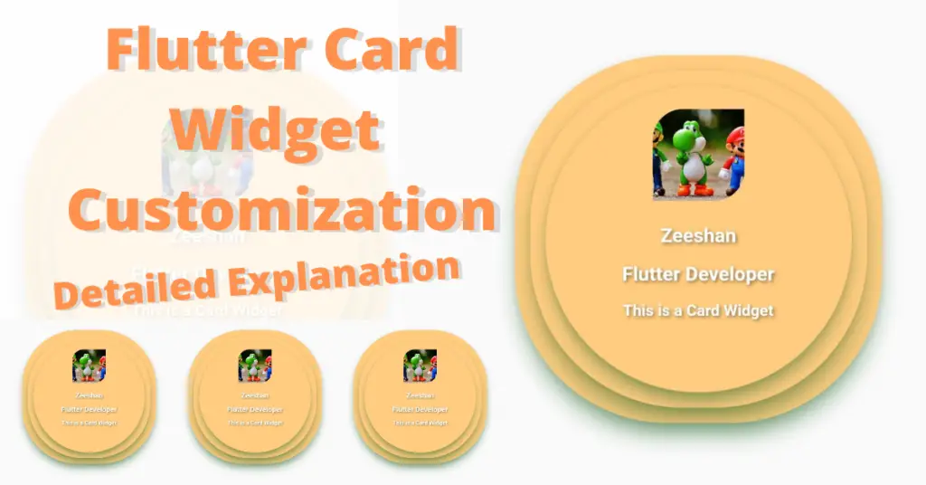
In this article, we will discuss flutter card in detail, how to customize flutter card widget, what’s the role of flutter card in flutter app, what properties it has and how we can customize card UI flutter depending on our design. But before that, if you want a complete setup on how to install flutter then click here. So without wasting any more time, let’s just get right into implementing our beautiful flutter card widget.
Introduction: Flutter Card
A flutter card is basically a sheet which can be used to show some related information, like for example, an album etc. Let’s understand how to implement the flutter card widget in our flutter app.
Flutter Card Widget Implementation
Card()
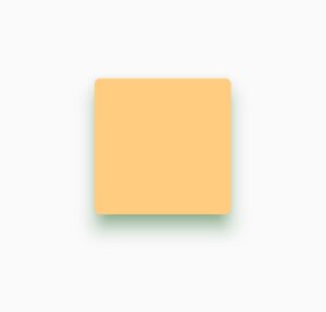
By calling the card class, we have implemented our flutter card widget but we won’t see it on our flutter app screen because it has no height or width. For that, we have to wrap it inside a container or a sized box widget. Let’s see how:
SizedBox(

          height: 100,

          width: 100,

          child: Card(),

        )
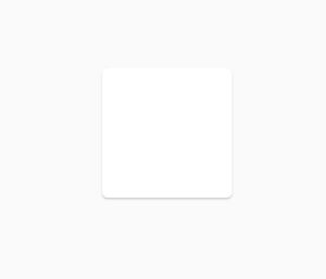
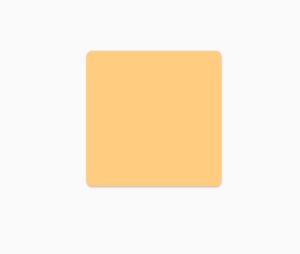
Flutter Card Color
color: Colors.orange.shade200
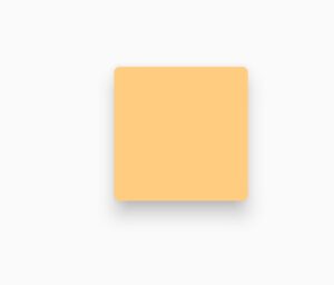
Flutter Card Elevation
elevation: 10
Flutter Card Margin
margin: EdgeInsets.all(20)
Flutter Card Shadow Color
shadowColor: Colors.green
Flutter Card Shape
  shape: RoundedRectangleBorder(

                borderRadius: BorderRadius.circular(100)
                                )
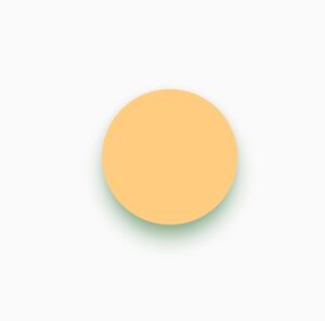
Using the flutter card shape constructor, we can customize the flutter card shape. We have used a round rectangle border class and by using its border radius constructor, we have see all the borders to have a circular shape of value 100. Let’s see our card now:
Flutter Card Child
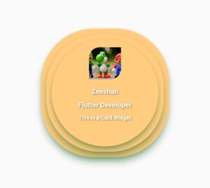
Flutter card child constructor is used to give a child widget to the flutter card. The child can be a row widget, column widget, image widget etc.
Conclusion
That’s all for this article, hope you enjoyed it and have learnt a lot from it. Implement it in your code and share your experience with us. We would love to see how you have used it in your flutter app. We would be looking forward for your response. Hope to see you in our next articles in which we will dig deep into other amazing Flutter widgets. Thank you.
